

Great interiors begin with decisions that balance beauty, performance and context. A surface is never experienced in isolation: natural light, nearby colors, scale and daily use all shape the final result.
In this extended guide, we move from early inspiration to practical selection. The following sections demonstrate how a long article behaves when it contains several images, alternating layouts, detailed paragraphs and an embedded video.
فضاهای داخلی چشمگیر با تصمیمهایی آغاز میشوند که میان زیبایی، عملکرد و زمینه تعادل برقرار میکنند. هیچ سطحی بهتنهایی تجربه نمیشود؛ نور طبیعی، رنگهای پیرامون، مقیاس و شیوه استفاده روزمره همگی نتیجه نهایی را شکل میدهند.
در این راهنمای جامع، از الهام اولیه تا انتخاب عملی پیش میرویم. بخشهای بعد نشان میدهند یک مقاله بلند با چندین تصویر، چیدمانهای متناوب، پاراگرافهای مفصل و ویدئوی داخلی چگونه نمایش داده میشود.
Use samples in the real space whenever possible. Observe them in morning and evening light, compare finishes from different angles and consider how the material will be cleaned and maintained over time.
هر زمان ممکن است نمونهها را در فضای واقعی امتحان کنید. آنها را در نور صبح و عصر ببینید، پرداختها را از زاویههای مختلف مقایسه کنید و شیوه نظافت و نگهداری متریال را در طول زمان در نظر بگیرید.

Start with the atmosphereاز حالوهوای فضا شروع کنید
Before comparing technical details, define the feeling the room should create. Warm surfaces can make large spaces feel inviting, while cooler tones often produce a precise and contemporary character.
Look at the entire palette together. Flooring, walls, furniture and natural light should support one another rather than compete for attention.
پیش از مقایسه جزئیات فنی، احساسی را که قرار است فضا ایجاد کند مشخص کنید. سطوح گرم میتوانند فضاهای بزرگ را صمیمیتر کنند، در حالی که طیفهای سرد معمولاً شخصیتی دقیق و معاصر میسازند.
تمام پالت را در کنار هم ببینید. کف، دیوارها، مبلمان و نور طبیعی باید بهجای رقابت برای جلب توجه، یکدیگر را تکمیل کنند.
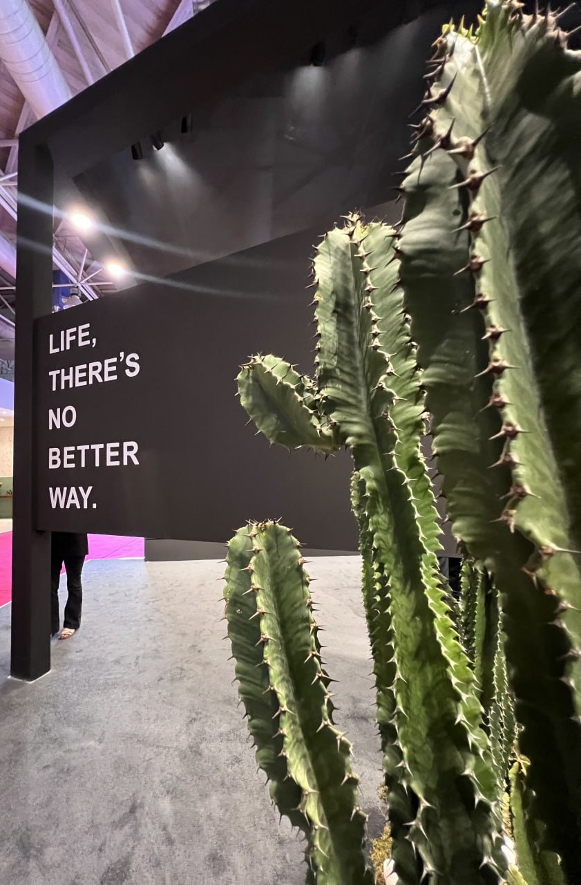
Understand scale and proportionمقیاس و تناسب را بشناسید
Large-format surfaces reduce visual interruptions and help compact rooms appear more continuous. Smaller modules introduce rhythm and can highlight transitions between functional areas.
Always compare the sample with the dimensions of the room. A pattern that feels subtle in a showroom may become much stronger across an entire wall.
سطوح بزرگابعاد گسستهای بصری را کاهش میدهند و کمک میکنند فضاهای کوچک یکپارچهتر به نظر برسند. قطعات کوچکتر ریتم ایجاد میکنند و میتوانند مرز میان نواحی کاربردی را برجسته کنند.
همیشه نمونه را با ابعاد اتاق مقایسه کنید. الگویی که در شوروم ظریف به نظر میرسد، ممکن است روی یک دیوار کامل بسیار پررنگتر دیده شود.
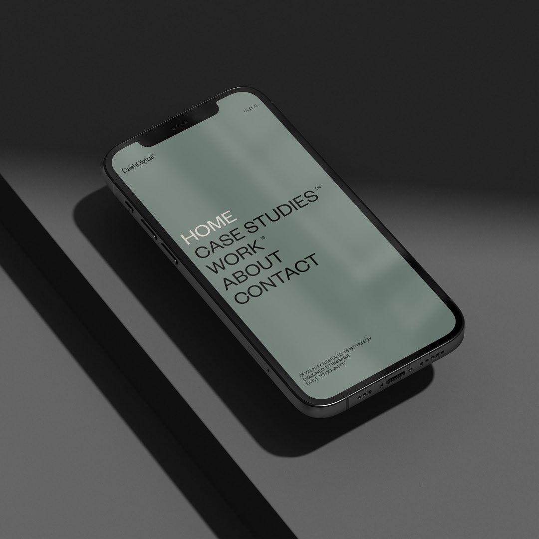
Texture changes with lightبافت با نور تغییر میکند
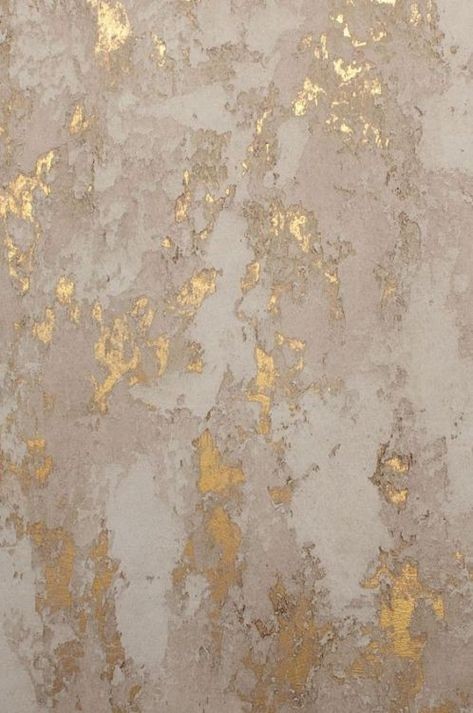
Texture becomes visible through shadow. Place the sample near windows and artificial lighting to understand how its relief behaves throughout the day.
Matte finishes diffuse reflections and feel soft, while polished finishes add depth and brightness. Neither is universally better; the correct choice depends on use, light and the desired mood.
بافت از طریق سایه دیده میشود. نمونه را کنار پنجره و زیر نور مصنوعی قرار دهید تا رفتار برجستگیهای آن را در ساعات مختلف روز ببینید.
پرداخت مات بازتابها را پخش میکند و حسی نرم دارد، در حالی که پرداخت پولیش عمق و روشنایی بیشتری ایجاد میکند. هیچکدام همیشه برتر نیست؛ انتخاب درست به نوع استفاده، نور و حس موردنظر بستگی دارد.
See the material in motionمتریال را در حرکت ببینید
Video reveals reflections, depth and movement that a still image cannot fully communicate. Watch how the surface responds as the viewing angle changes.
ویدئو بازتاب، عمق و حرکتی را نشان میدهد که تصویر ثابت نمیتواند بهطور کامل منتقل کند. ببینید سطح با تغییر زاویه دید چگونه واکنش نشان میدهد.
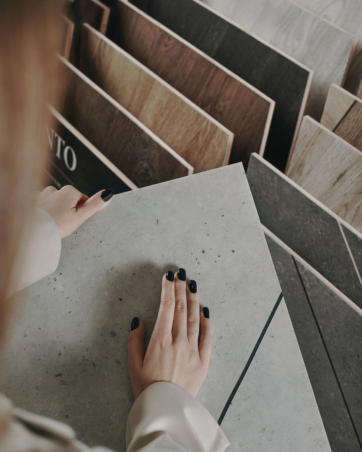
Balance appearance and performanceمیان ظاهر و عملکرد تعادل برقرار کنید
A successful specification must work after the photography is finished. Consider traffic, moisture, heat, cleaning products and the frequency of maintenance.
For busy environments, prioritize durable finishes and simple care routines. In quieter spaces, delicate textures can be used as intentional focal points.
یک انتخاب موفق باید پس از پایان عکاسی هم کارآمد بماند. میزان تردد، رطوبت، حرارت، مواد شوینده و دفعات نگهداری را در نظر بگیرید.
برای فضاهای پرتردد، پرداختهای بادوام و روشهای نگهداری ساده را در اولویت قرار دهید. در فضاهای آرامتر میتوان از بافتهای ظریف بهعنوان نقطه کانونی هدفمند استفاده کرد.
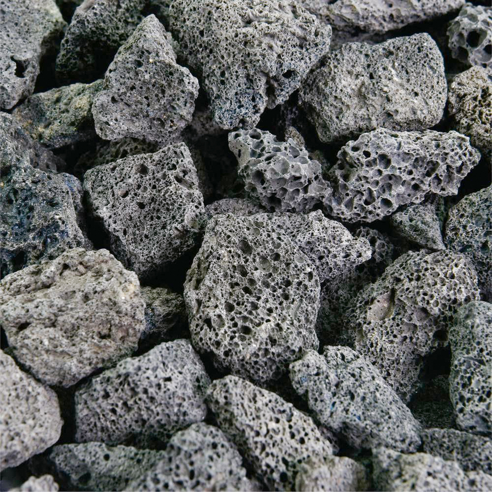
Build a coherent paletteیک پالت منسجم بسازید
Limit the number of dominant materials and allow each one to have a clear role. Repeating a tone or finish in several locations helps the project feel deliberate and connected.
Contrast can still be powerful. Use it where attention is useful, such as an island, reception wall or feature volume.
تعداد متریالهای غالب را محدود کنید و برای هرکدام نقش مشخصی در نظر بگیرید. تکرار یک رنگ یا پرداخت در بخشهای مختلف باعث میشود پروژه هدفمند و یکپارچه به نظر برسد.
کنتراست همچنان میتواند قدرتمند باشد. آن را جایی به کار ببرید که جلب توجه مفید است؛ مانند جزیره آشپزخانه، دیوار پذیرش یا یک حجم شاخص.
Review before final approvalپیش از تأیید نهایی بازبینی کنید
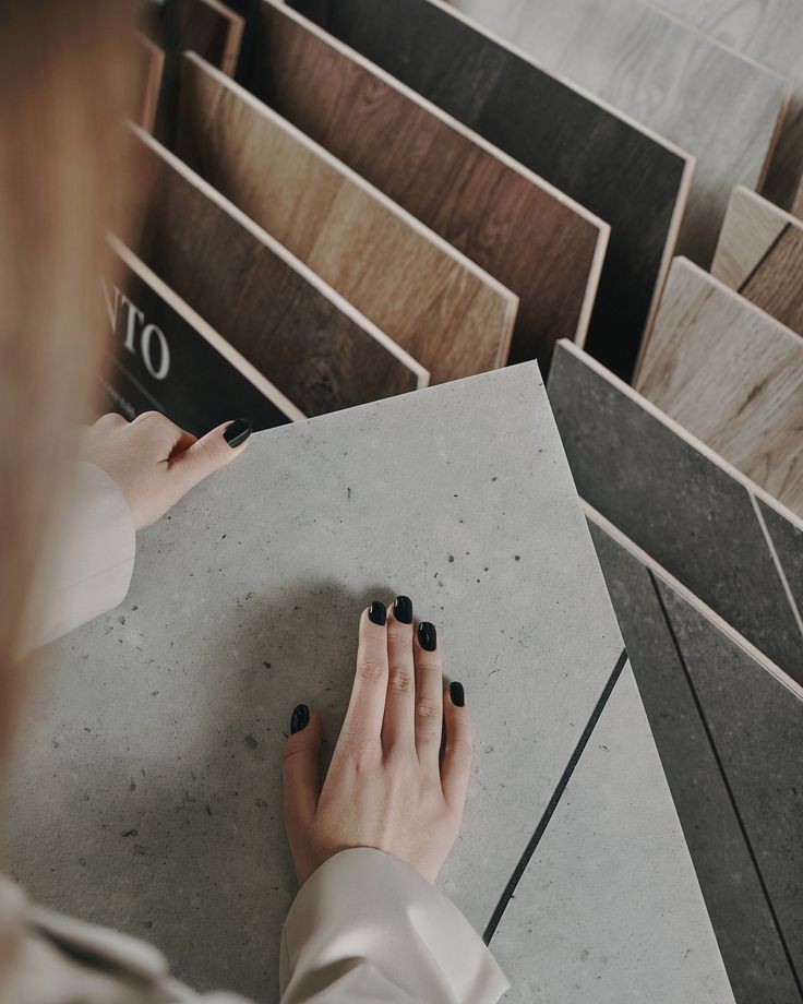
Create a final sample board and review every item together under the lighting planned for the space. Confirm joints, edge details and transitions before installation begins.
This final check often resolves small inconsistencies early and protects the clarity of the finished design.
یک برد نهایی از نمونهها آماده کنید و همه موارد را زیر نور برنامهریزیشده برای فضا در کنار هم ببینید. پیش از آغاز نصب، بندها، جزئیات لبه و محل اتصال سطوح را تأیید کنید.
این بررسی نهایی معمولاً ناهماهنگیهای کوچک را زودتر برطرف میکند و وضوح طراحی اجراشده را حفظ میکند.
nice content
The comparison between matte and polished finishes was genuinely useful. I especially liked the advice about checking samples at different times of day.
A clear and practical guide. The section about scale helped me understand why the same pattern can feel very different in a larger room.
Could you publish another article about choosing surfaces for high-traffic commercial spaces?
The video makes the texture much easier to understand than still images alone. Very helpful presentation.
I appreciate that the article discusses maintenance as well as appearance. It makes the recommendations feel realistic and useful.